Great idea, Erik!

Published on Aug. 28, 2017 by Steven Vance


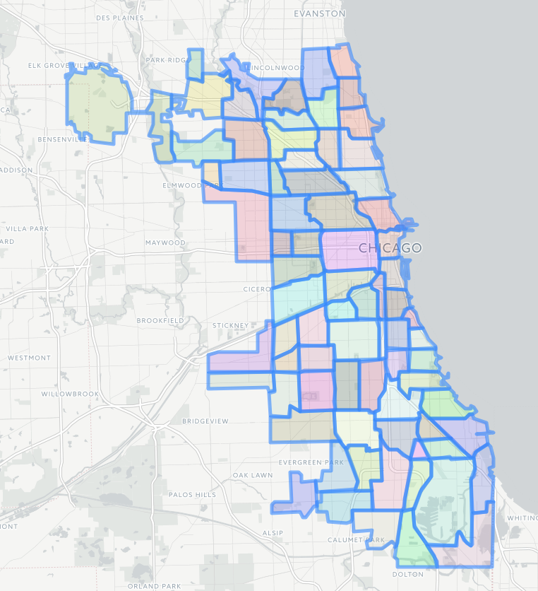
Great idea, Erik! I’ve updated the post to show the overlapping maps in different colors. It was possible after updating the code on the Maps Explorer to be able to display every section of the map in a random color so it’s easier to spot the differences. Here’s what the community area map can look like now:


← Older article
Ask Cityscape: Where do your “neighborhood” maps come from?
Newer article →
Has the Mayor proposed a competing anti-gentrification regulation for Logan Square?

Other posts by Steven Vance full archive

March 2026
February 2026
January 2026
December 2025
November 2025
September 2025
August 2025
July 2025
June 2025
April 2025